How research, data, trade-offs, and stakeholder realities shaped a critical UX decision
Year:
2025
Timeline:
8 weeks

Overview
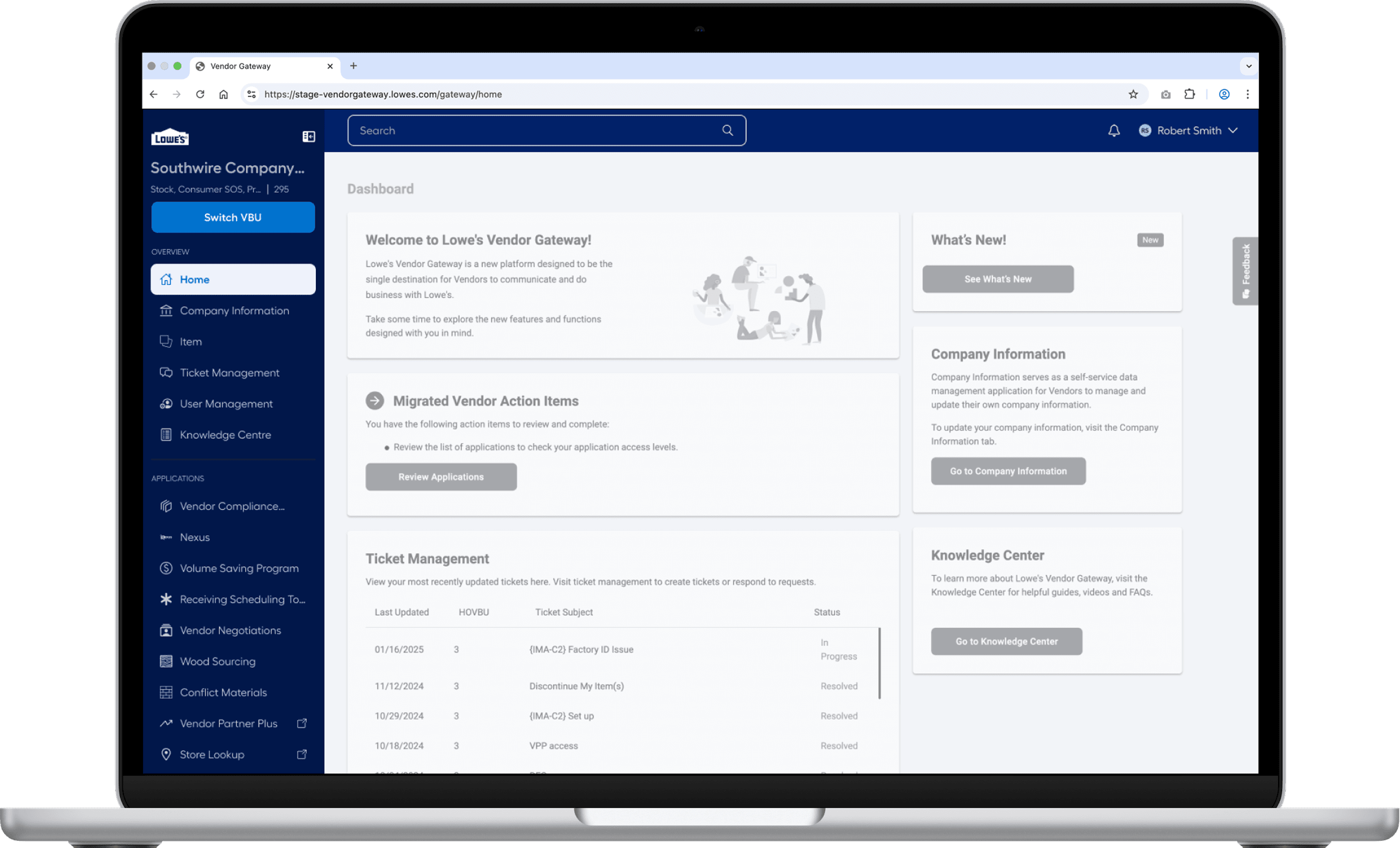
Vendor Gateway is a mission-critical B2B platform used daily by vendors and internal associates to manage business operations. Over time, its navigation system became:
Visually heavy
Inconsistent across applications
Difficult to scale as new tools were added
Despite these issues, the navigation was deeply familiar to users, which made redesigning it especially risky.
➡️ Any change here could either improve efficiency… or break trust.
Why this case study matters?
The project wasnt about designing a prettier masthead. It was about making a high-stake product decision that affected.
Thousands of vendors
Multiple engineering teams across orgs
A growing ecosystem of enterprise applications
The challenge wasn't what could be designed — It was what should be shipped
My Role
As a Product Designer, I partnered closely with product researchers, engineering, and platform teams to:
Translate navigation pain points into testable design directions
Design and prototype multiple competing solutions
Use data- not opinion- to guide a final recommendation
Advocate for a decision that balanced UX quality, user trust, and organizational feasibility.

The Real Problem
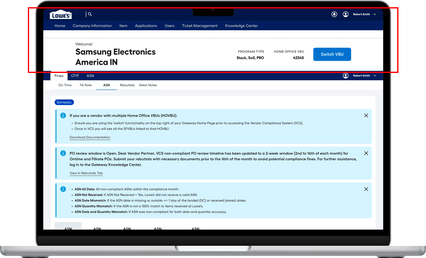
The platform supports multiple enterprise applications used by vendors and internal associates daily. Over time, the masthead evolved across teams, resulting in the following
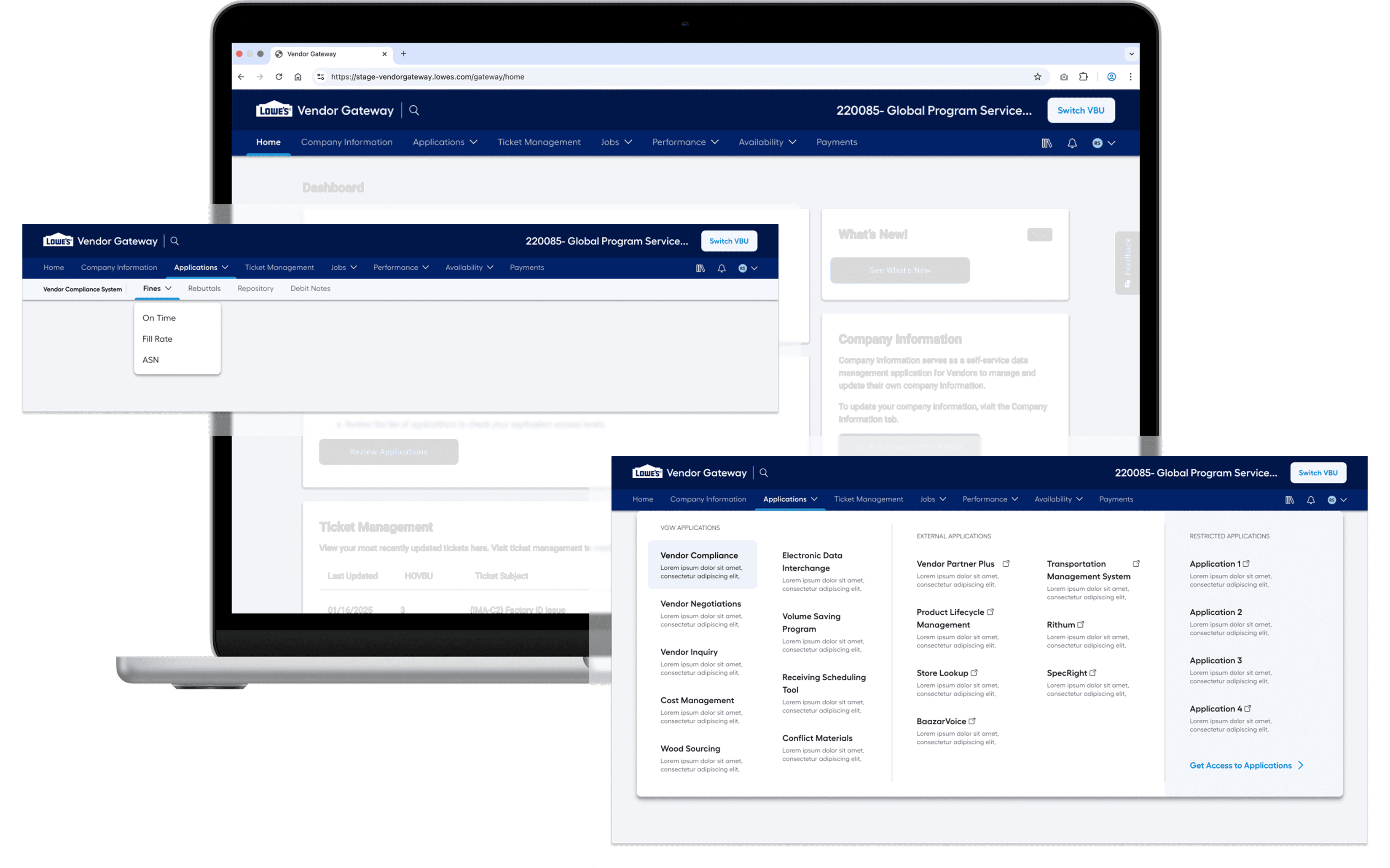
Inconsistent Navigation Structure Acoss Applications
Some teams repeat the masthead style, creating 2 sets of navigation in one platform, while others use a vertical nav, resulting in a fragmented experience.
Approx 22% viewport is consumed with the masthead
The masthead consumes a significant portion of the screen- reducing the space for critical content in the first fold.
Deeper hierarchies without scalability
The application’s three-level hierarchy exceeds the two-level navigation support, and its tab system lacks scalability to handle the growing number of teams and applications.
Critical page load delays creating friction
The platform experiences performance delays- taking 8 secs to load the application list & additional 4-5 secs to open one creating friction.
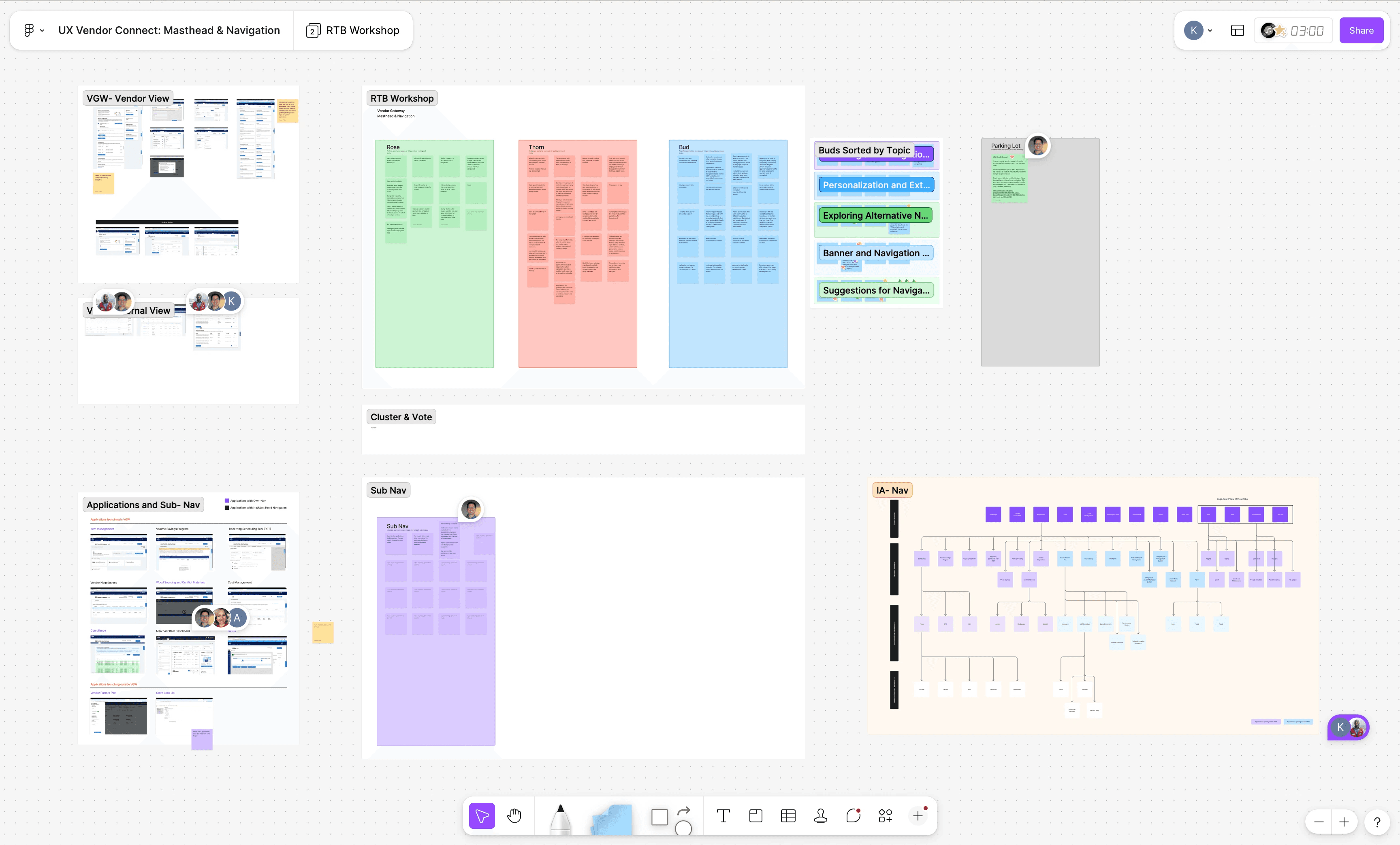
Step 1: Design Audit
Understanding the ecosystem before redesigning it.
Before proposing any solutions, I conducted a navigation audit across every application within Vendor Gateway.
I analyzed:
Primary navigation categories
Sub-navigation depth
Horizontal vs vertical pattern
Entry points and cross-linking logic
This helped me uncover:
Duplicate navigation patterns
Deep hierarchies that weren't scalable
Gaps where new features would not fit cleanly
Step 2: Workshop
Cross-team workshop: Designing with, Not for
Since each application has its own product and design team, I knew early alignment would determine success.
Workshop goals:
Understand what currently works for them
Identify recurring pain points
Align on shared navigation principles
What we learned:
Everyone agreed that it consumes vast amount of vertical space
Inconsistency was a growing issue
Teams were concerned about layout disruptions
Designing Competing Strategic Directions

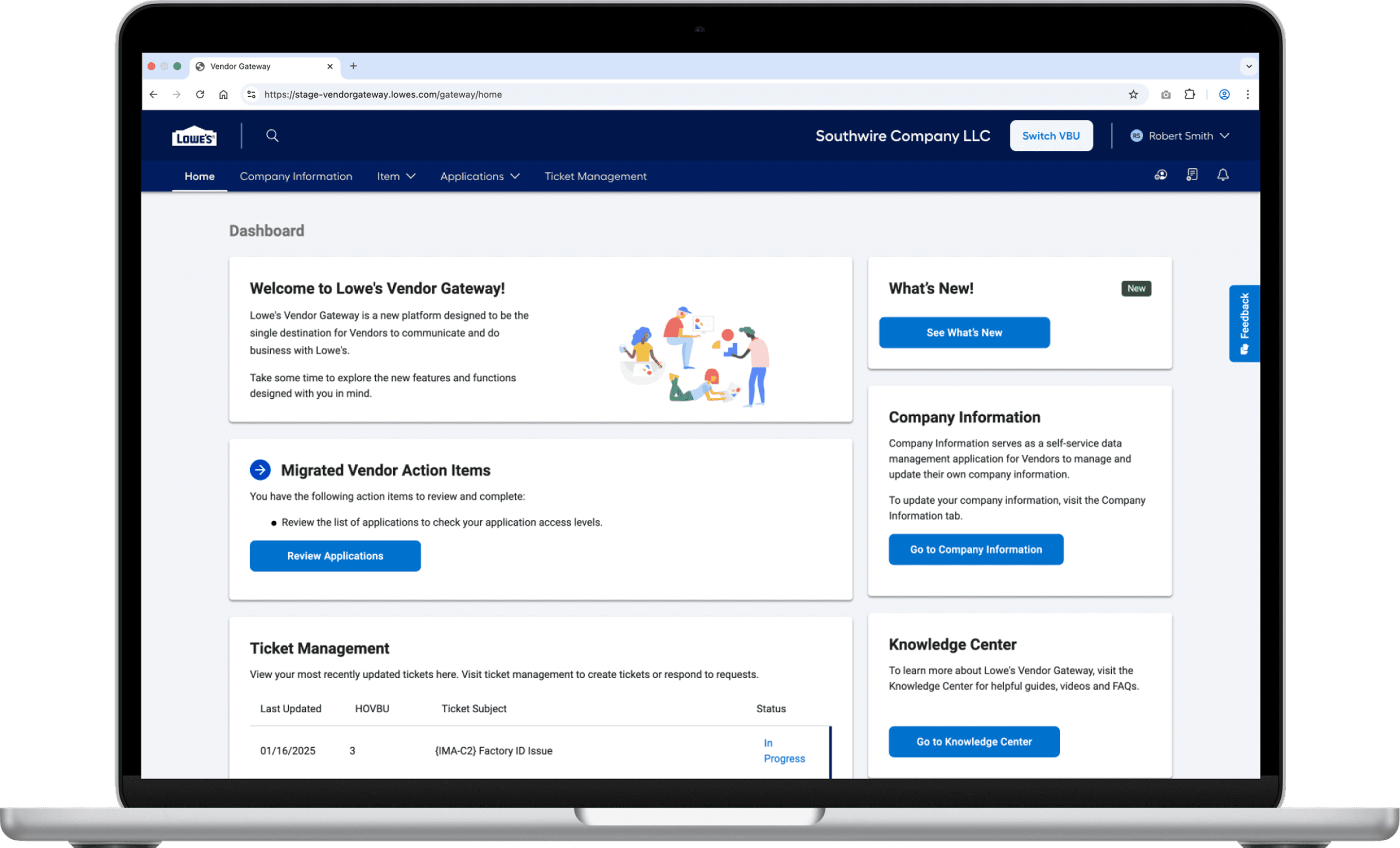
Option 1: Refined Horizontal Navigation (VBU at top)
An evolution of the current layout.
Strategic Intent:
Preserve familiarity
Reduces masthead height (22% -> 10%)
Easy access to applications through mega menu (minimizes disruption)
Using of icons for various sections (Increases space for relevant tabs)
Cross-team alignment possible
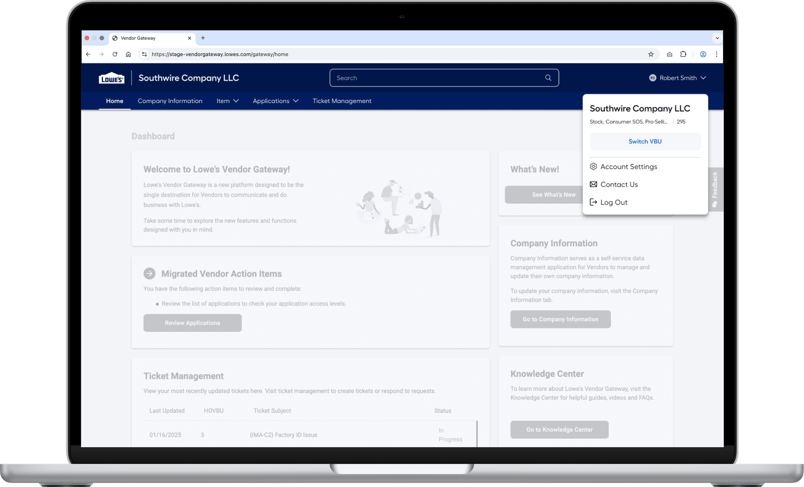
Option 2: VBU within profile
Cleaner, more consumer-aligned approach.
Strategic Intent:
Reduce visual weight
Reduces masthead height (22% -> 10%, 12% reduction)
Easy access to applications through mega menu (minimizes disruption)
Align with global UX standards
Option 3: Vertical Navigation
A scalable enterprise pattern.
Strategic Intent:
Support deep hierarchies
Expand content real estate
Future-proof the ecosystem
Con:
Cross-collaboration implementation nearly impossible
Why research was non-negotiable?
Given the risk level, we avoided assumptions and ran a mixed-method study by rolling out a survey with:
118 participants
External vendors and internal associates
Quantitative ranking + qualitative feedback
What the data challenged?
There was no single "best" navigation for everyone.
Vendors vs Associates
Vendors strongly preferred horizontal masthead, mainly for its familiarity.
While Associates were open in trying a new option, and leaned towards vertical navigation
Single vs Multiple VBU Users
Single VBU users valued space efficiency and hence liked both option 1 and option 3.
Whereas Multi-VBU users prioritized option 1 for its quick access and visibility of the Switch VBU button.
Switch VBU placement mattered
Vendors strongly disliked the option where the Switch VBU button was within the profile, as it was not readily visible and accessible.
Switch VBU at the top emerged as the most responsible decision, as it was delivering meaningful improvement without breaking trust.
Ranked consistently high across vendor group
Reduced masthead footprint by 50%
Kept VBu switching prominent (critical for multi-VBU users)
The mega menu reduces navigation time by 6-7 seconds per interaction
Avoided forcing cross-team layout overhauls
Enabled gradual structural improvements
It respects users' mental model while still improving usability.
Impact
Significant vertical space reclaimed
Faster navigation efficiency
Clearer content hierarchy
Cross-team alignment
Reduced resistance to rollout
+
+
+


Let's Talk
Curious what we could build together? Let’s turn bold ideas into meaningful, high-impact experiences. Drop me an email at khuwalneha@gmail.com to learn more — or just to chat over a cup of coffee.
+
+
+